Brand Strategy & Identity System | Crimson FinchOverview
The Crimson Finch is an independent craft beer brand built from years of brewing passion, technical knowledge and a genuine love of community. What began as a homebrewing journey in 2016 evolved into an award-winning brewing practice, with founder Carl becoming a certified BJCP beer judge and winning Champion Brewer at the Queensland Amateur Brewing Championship.
By the time the brand was ready to move into the commercial space, the product had clear credibility and heart — but the visual identity did not yet reflect the quality, story or ambition behind it.
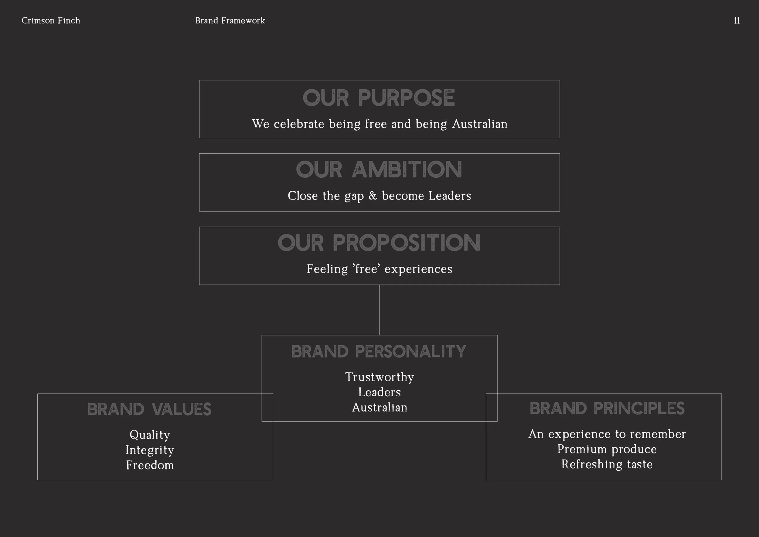
The brief was to create a brand identity system that felt distinctive, professional and memorable, while still retaining the warmth and personality of the founder’s story.
Client: The Crimson Finch
Industry: Craft Beer / Brewing
Project Type: Brand Strategy, Visual Identity, Logo System, Packaging Hierarchy
Timeframe: 3 months
The Challenge
The Crimson Finch had an incredible product and a strong founder narrative, but the brand itself needed structure, clarity and visual confidence.
The key challenges were:
Creating a brand identity that captured Carl’s passion, expertise and personality
Developing a logo and visual system that could stand confidently in the craft beer market
Building a flexible identity that could extend across beer labels, marketing collateral and future product ranges
Establishing a clear visual hierarchy for packaging and product labels
Creating consistency across all brand touchpoints so the business could make a stronger first impression
The brand needed to feel crafted, credible and community-driven — not generic, overly rustic or like another predictable craft beer label.
The Approach
The project began with a brand strategy and positioning phase to define the foundations of the business before moving into visual identity.
This included exploring the story behind the name, the founder’s brewing credentials, the target audience, the competitive landscape and the emotional tone the brand needed to communicate.
A key part of the process was translating the idea of the crimson finch itself — an Australian bird chosen for its sense of freedom, elegance and connection to place — into a visual identity that felt ownable and meaningful.
The brand needed to balance several qualities:
Technical brewing knowledge
Carl’s background as a BJCP judge and award-winning brewer gave the brand credibility and authority.
Community and approachability
The brand was not created to feel exclusive or intimidating. It was about quality beers “nested” in the community for people to enjoy.
Australian character
The name gave the brand a local, distinctive identity without falling into obvious Australiana clichés.
Craft and quality
The identity needed to feel considered, refined and commercially ready.
The Solution
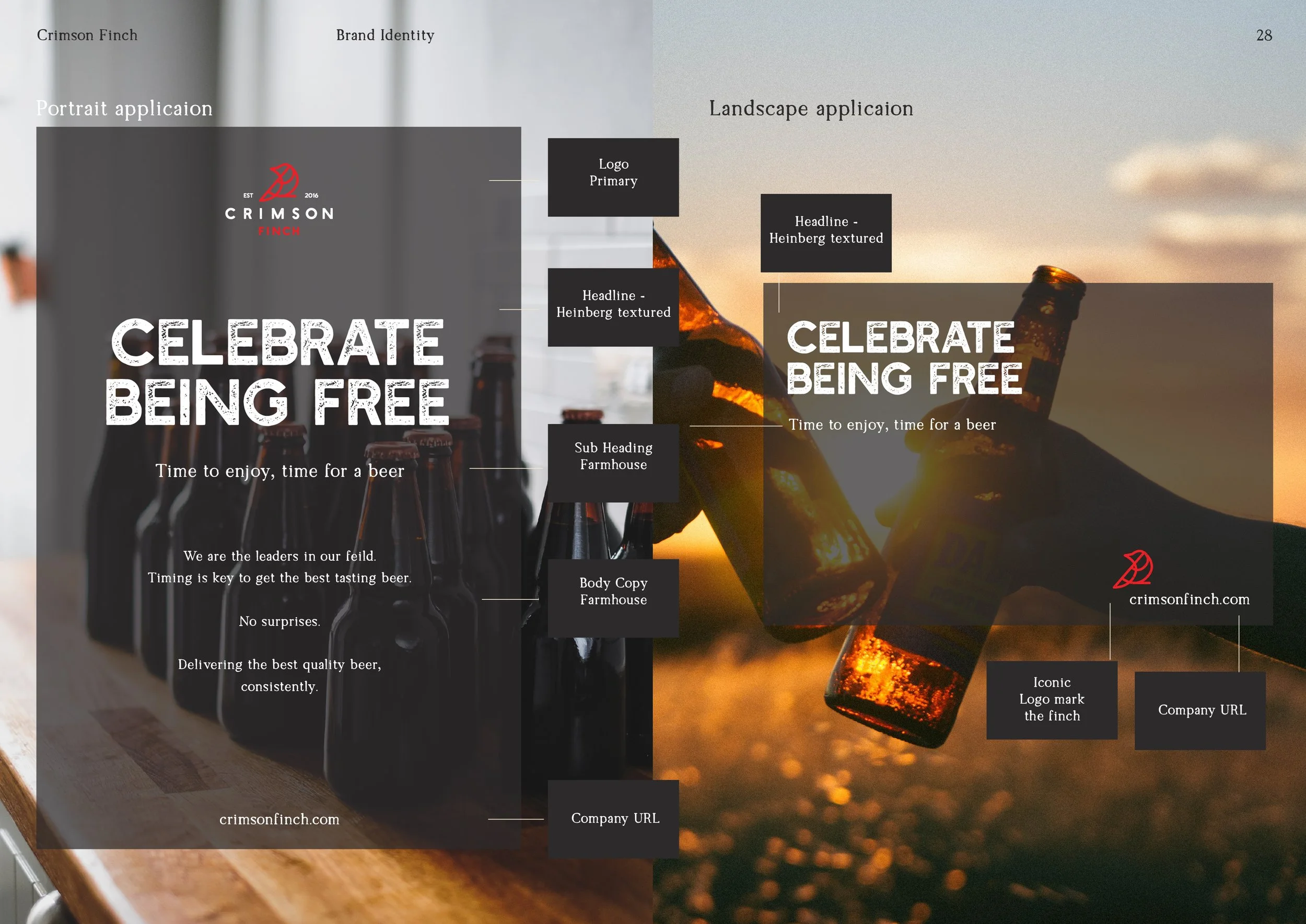
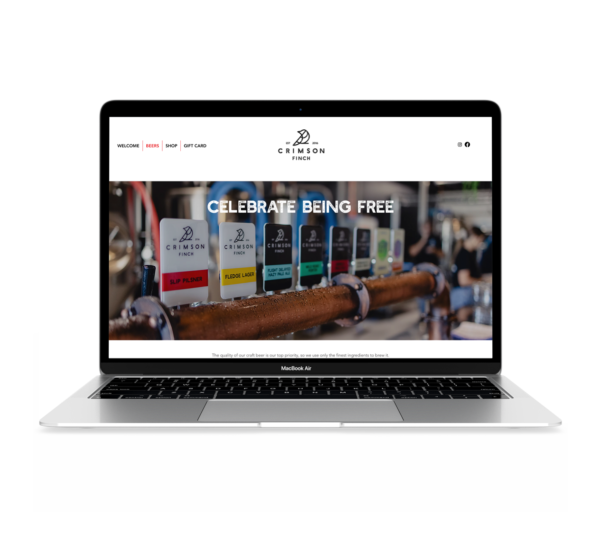
I developed a complete brand strategy and identity system for The Crimson Finch, including an overarching logo, supporting logo types, colour palette, typography system, graphic assets and visual direction for product labels.
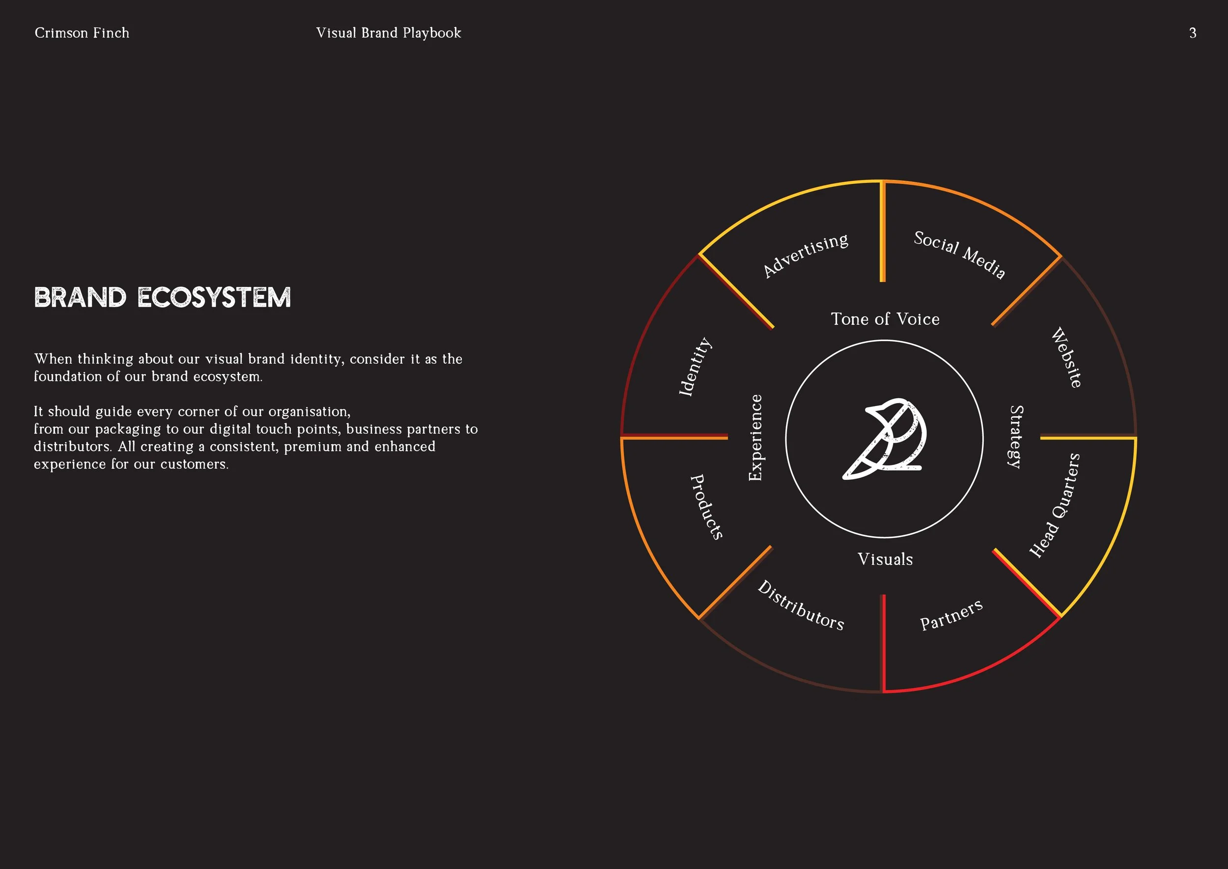
The identity system was designed to give the brand both personality and flexibility. The logo needed to work across multiple applications, from packaging and tap decals through to social media, signage and printed collateral.
A clear packaging hierarchy was also established to help future beer labels feel consistent while allowing each product to have its own personality. This gave the brand a scalable system rather than a single standalone logo.
The final Identity Guide included:
Brand strategy and positioning document
Mood board and visual direction
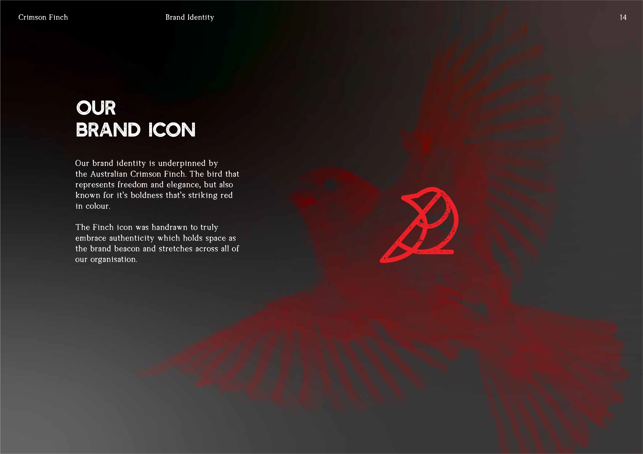
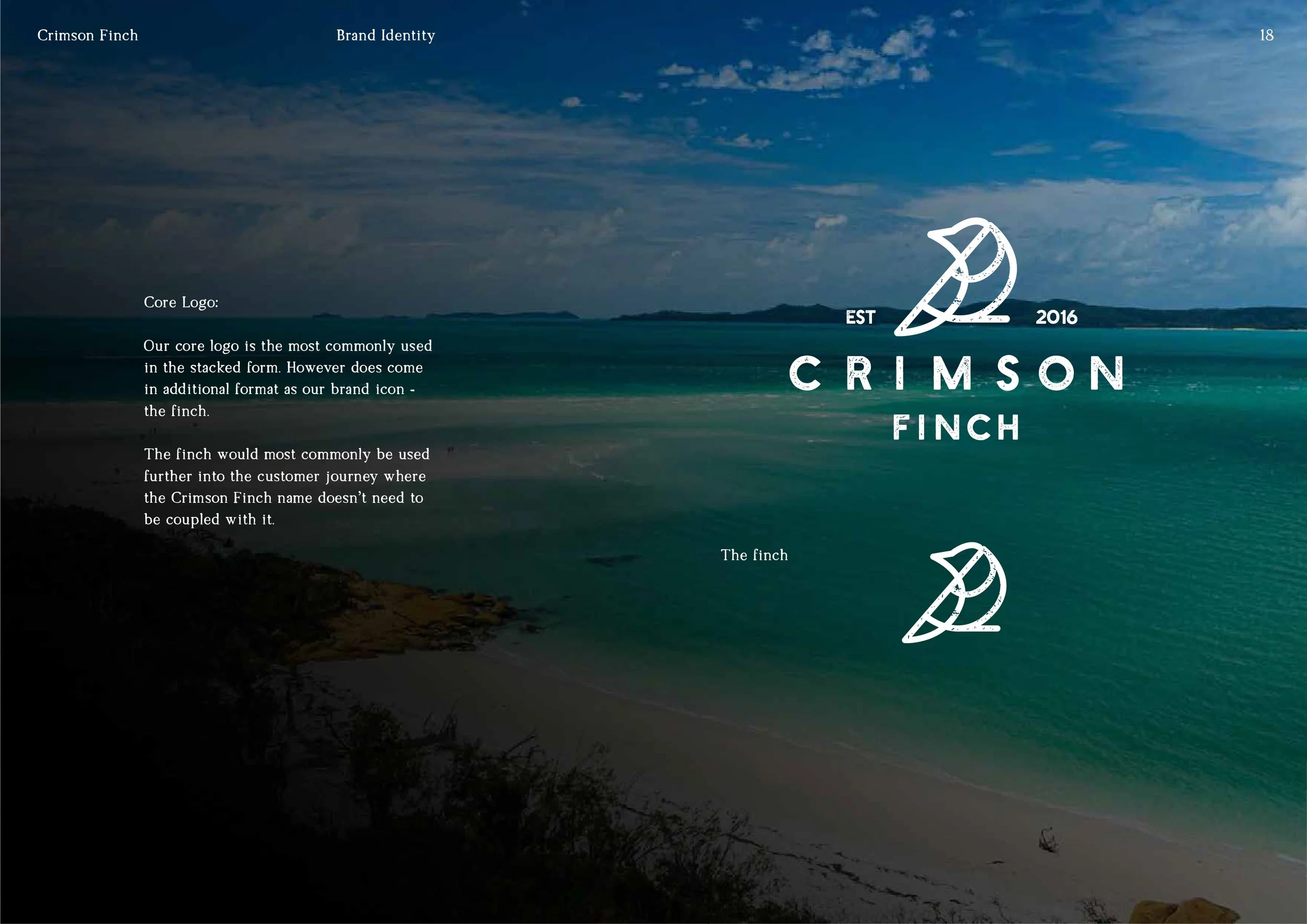
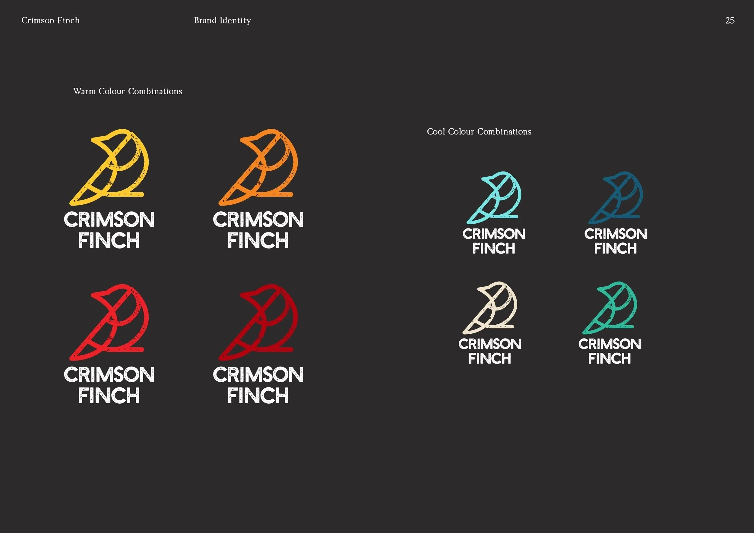
Primary logo design
Supporting logo variations
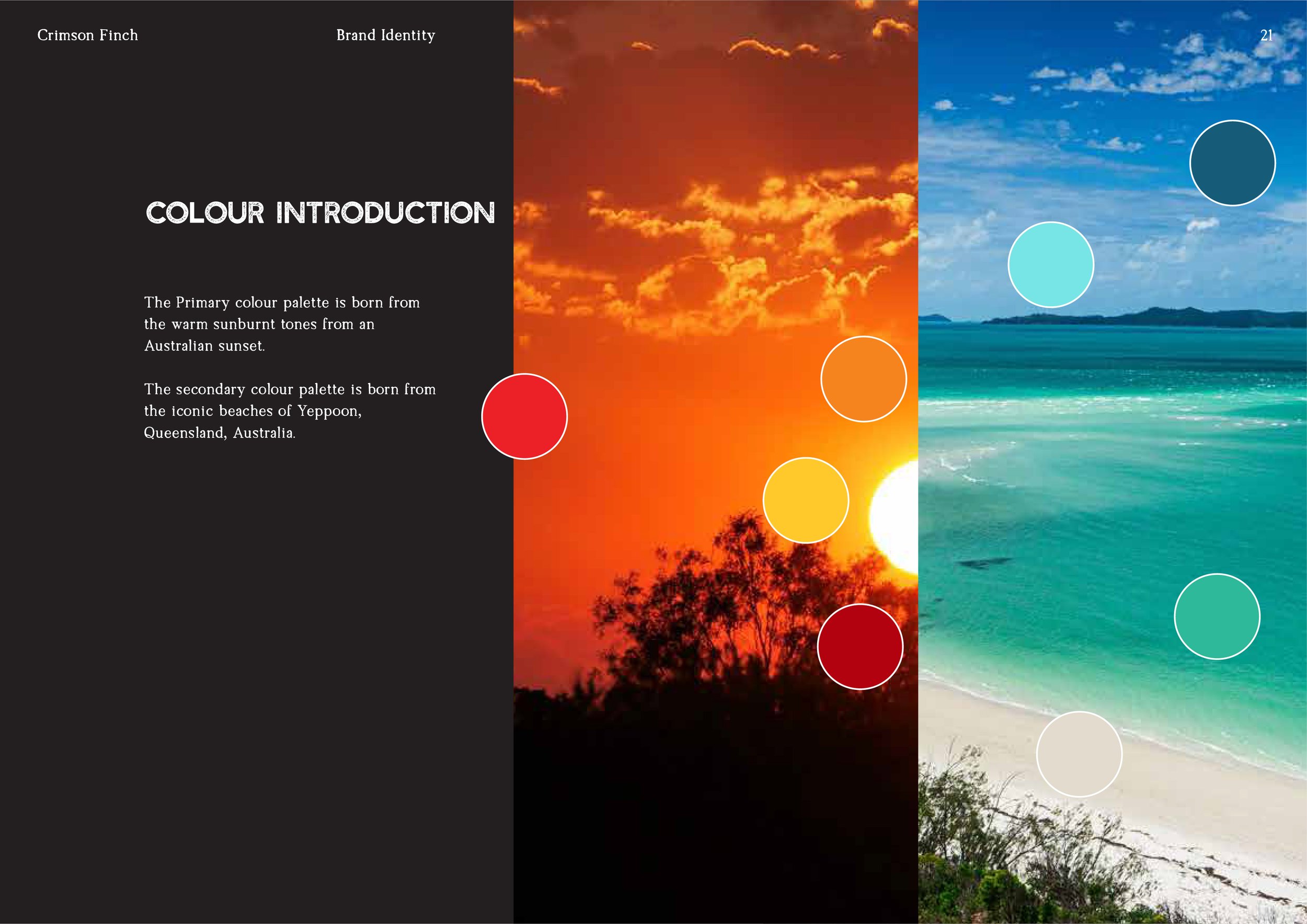
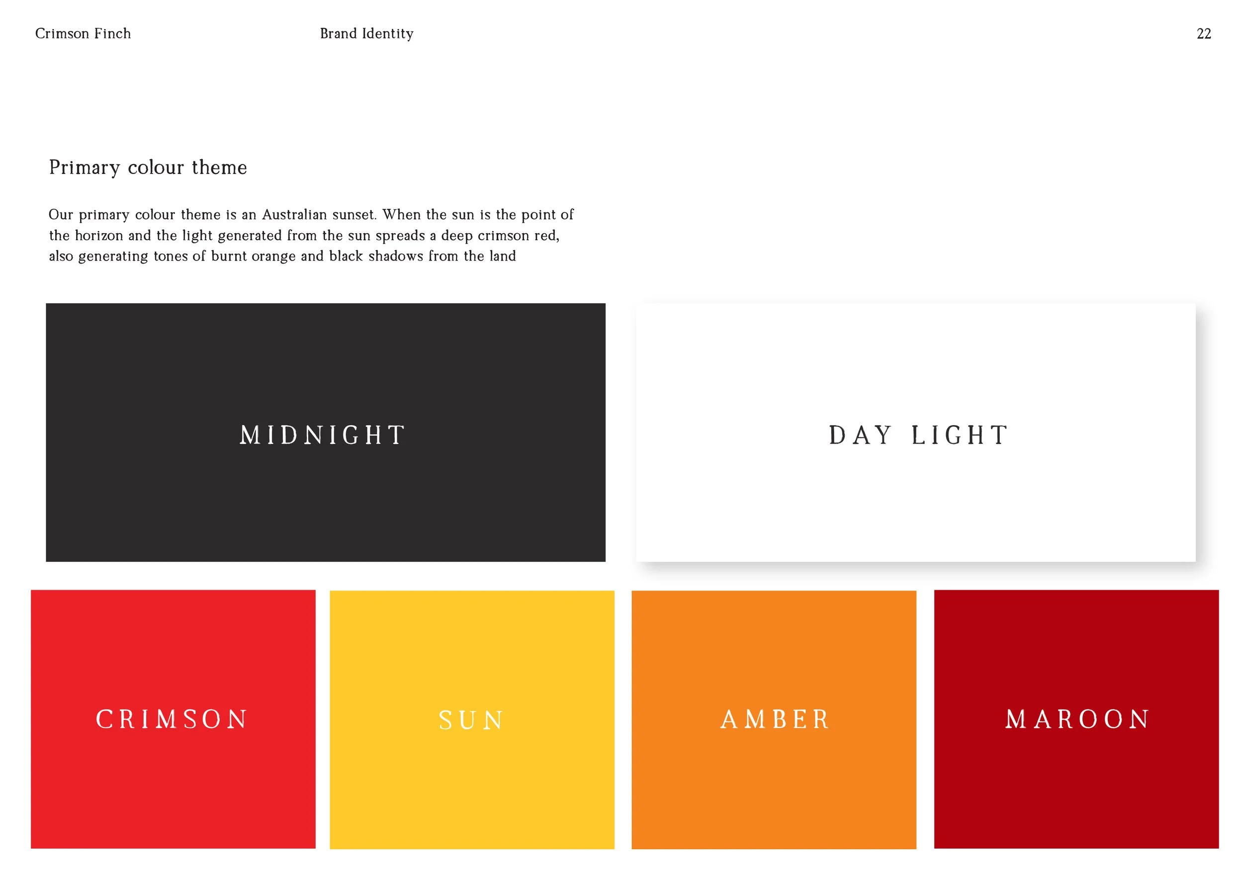
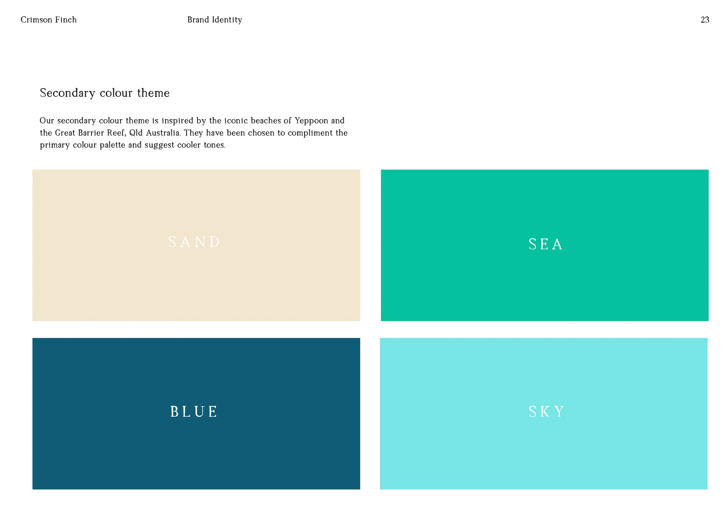
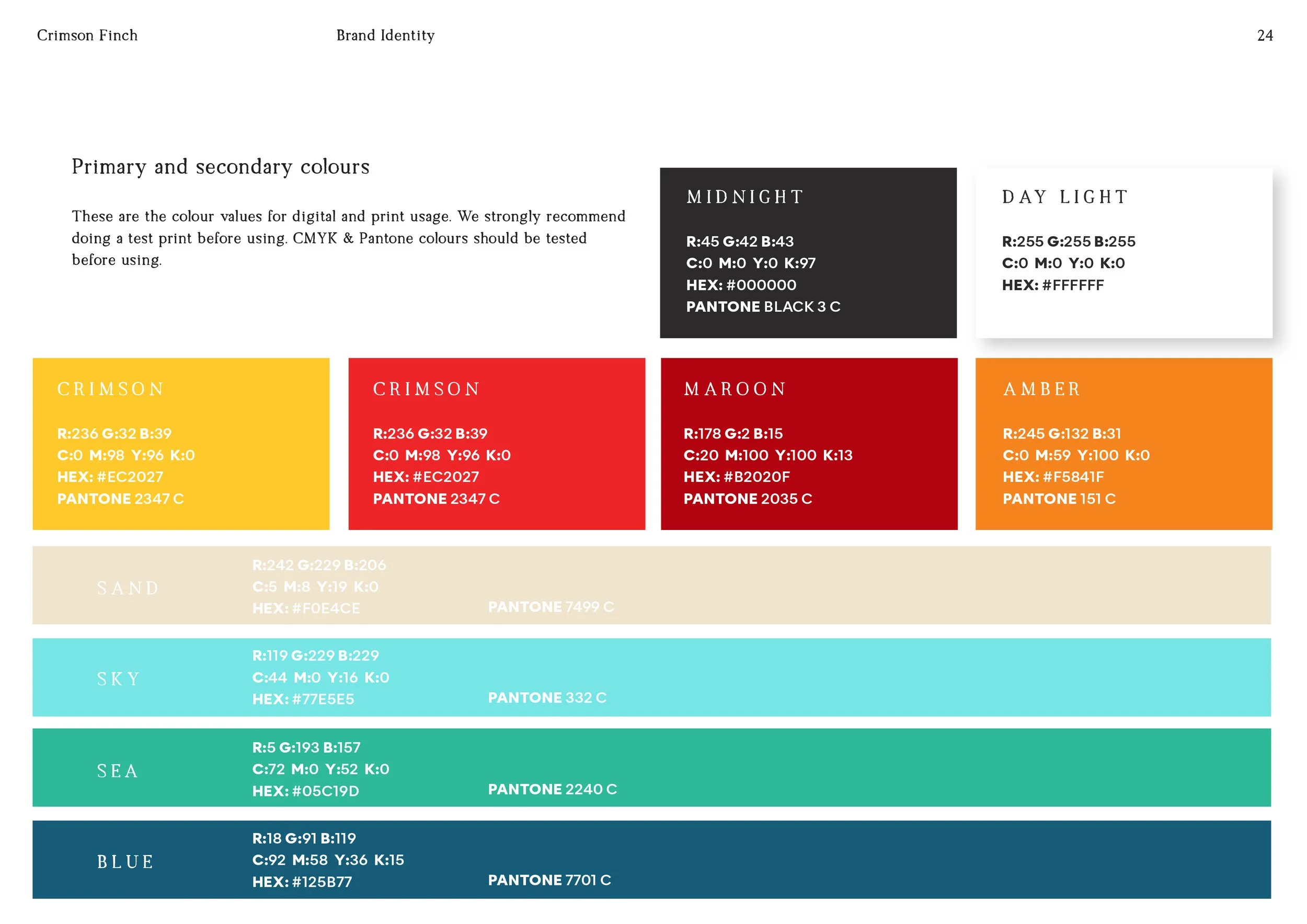
Colour palette and application guide
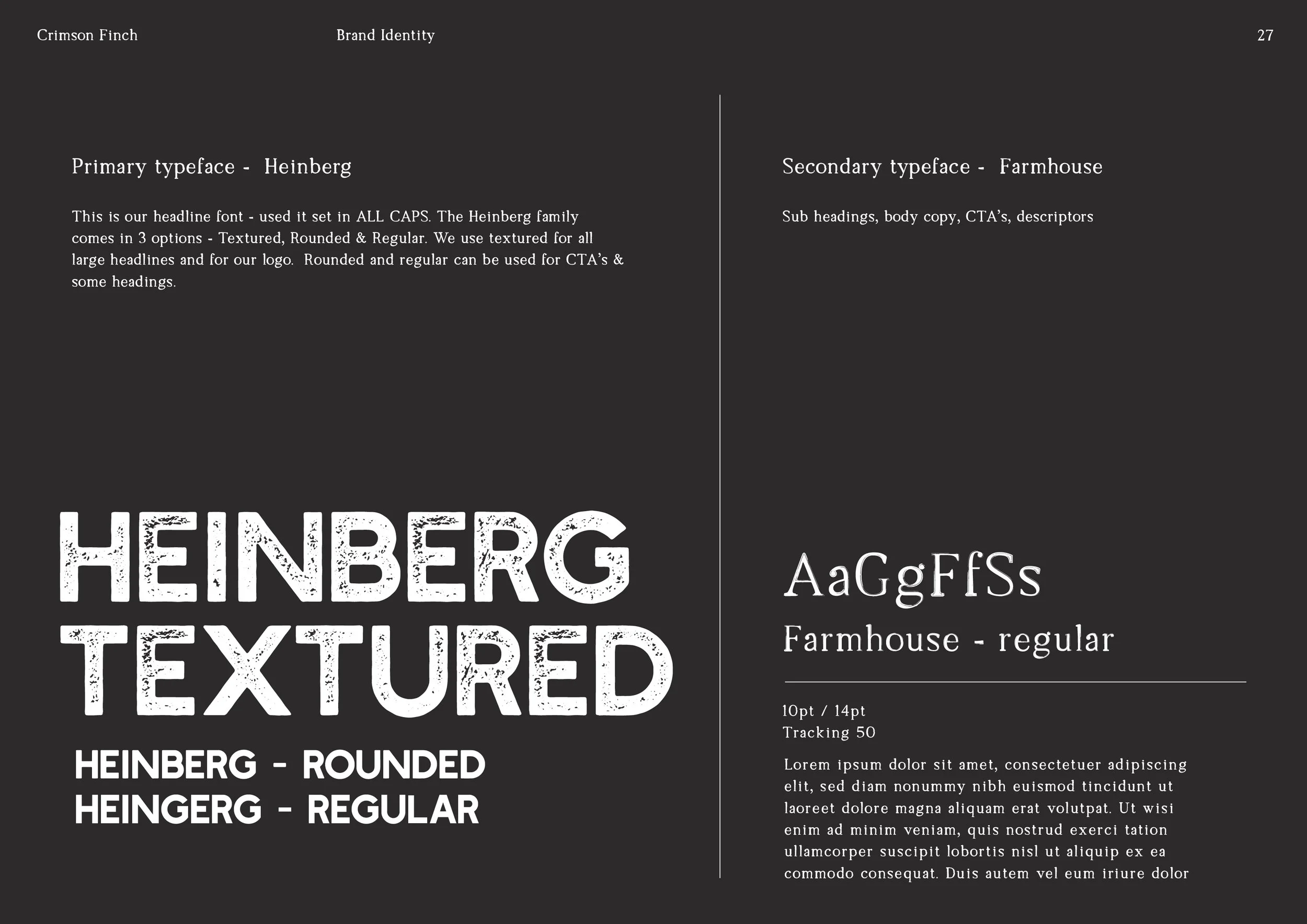
Typography recommendations
Graphic assets and supporting visual elements
Imagery, illustration and iconography direction
Packaging and label hierarchy guidance
Brand playbook to support future marketing and product rollout
Brand Direction
The final identity positioned The Crimson Finch as a craft beer brand with warmth, knowledge and character.
Rather than creating something overly masculine, industrial or trend-led, the brand direction leaned into a more refined and story-led approach. The crimson finch became a symbol of freedom, movement, craft and community — a visual anchor that gave the brand meaning beyond the product itself.
The visual system was designed to feel:
Confident but approachable
A brand that knows its craft but still feels welcoming.
Distinctive but flexible
Recognisable enough to build brand equity, with enough range to support different beer styles.
Crafted but not cliché
Rooted in brewing culture without relying on predictable craft beer tropes.
Community-minded
A brand created for people to gather around, not just consume.
Outcome
Over the three-month project, The Crimson Finch was transformed from an early-stage business idea with a strong product story into a commercially ready brand identity system.
The final brand gave Carl and his team a clear visual foundation to launch with confidence. It provided consistency, recognition and a stronger first impression across packaging, marketing and future brand communications.
Most importantly, the identity reflected the true essence of the business: quality craft beer, backed by real brewing knowledge, created for the community.
Project Summary
For The Crimson Finch, I delivered a full brand strategy and visual identity system that translated the founder’s brewing journey, technical expertise and community vision into a cohesive brand.
The result was a flexible and memorable identity designed to support product labels, marketing collateral and future brand growth — giving the business the clarity and confidence it needed to stand out in the craft beer market.
