Cert Lane Building Certifiers
ONE: The Challenge
Cert Lane's website had evolved over time and lacked clear pathways for users to understand services, industry relevance and certification processes. The objective was to simplify complex information, improve navigation and create a more customer-focused experience.
Branding
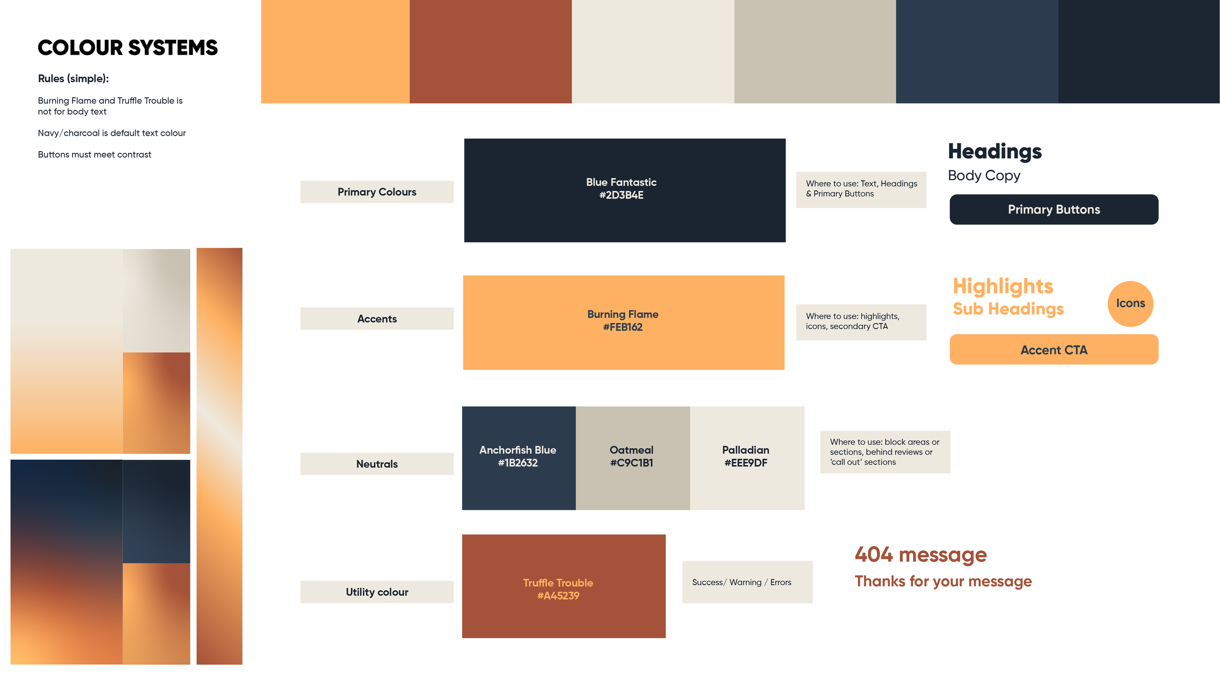
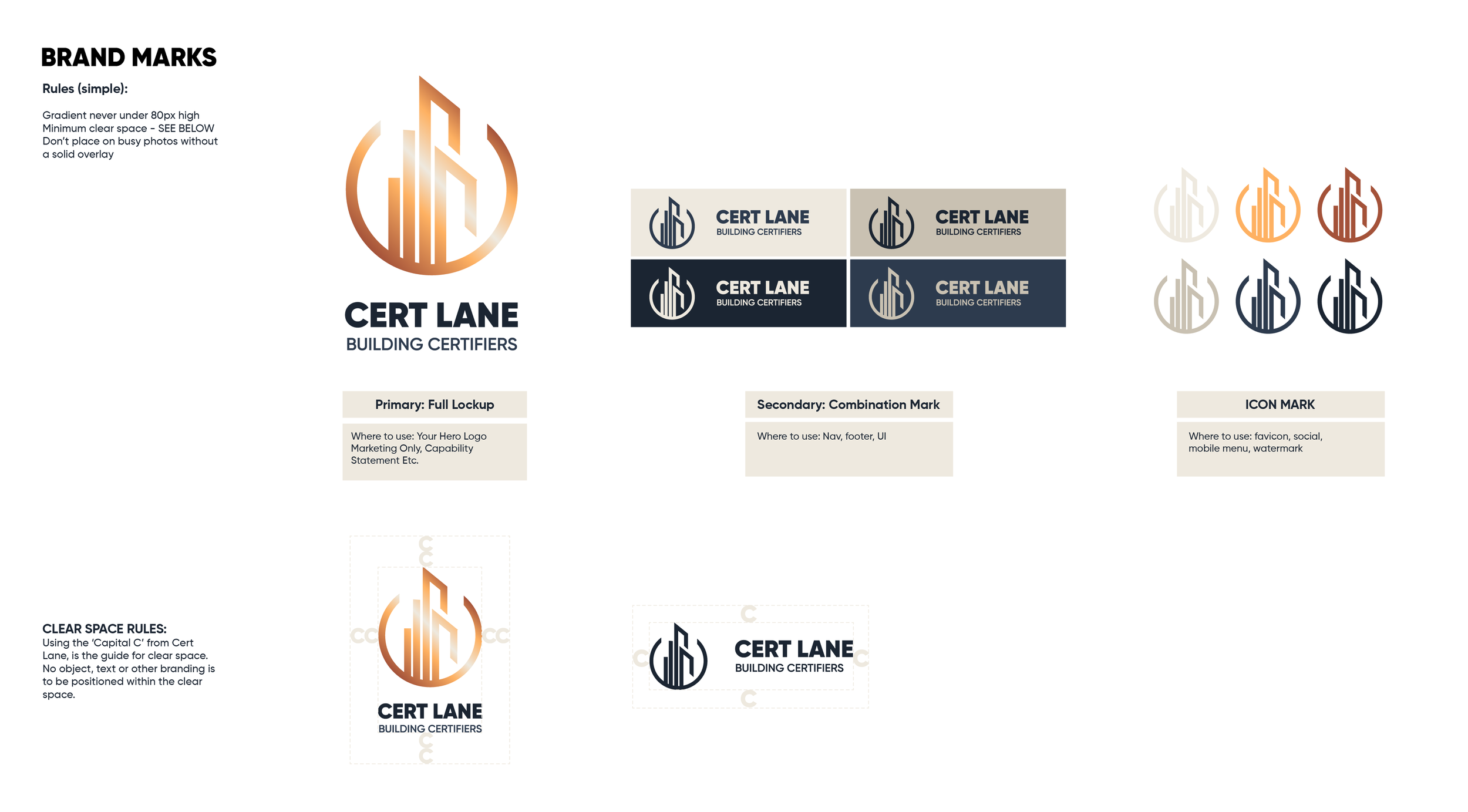
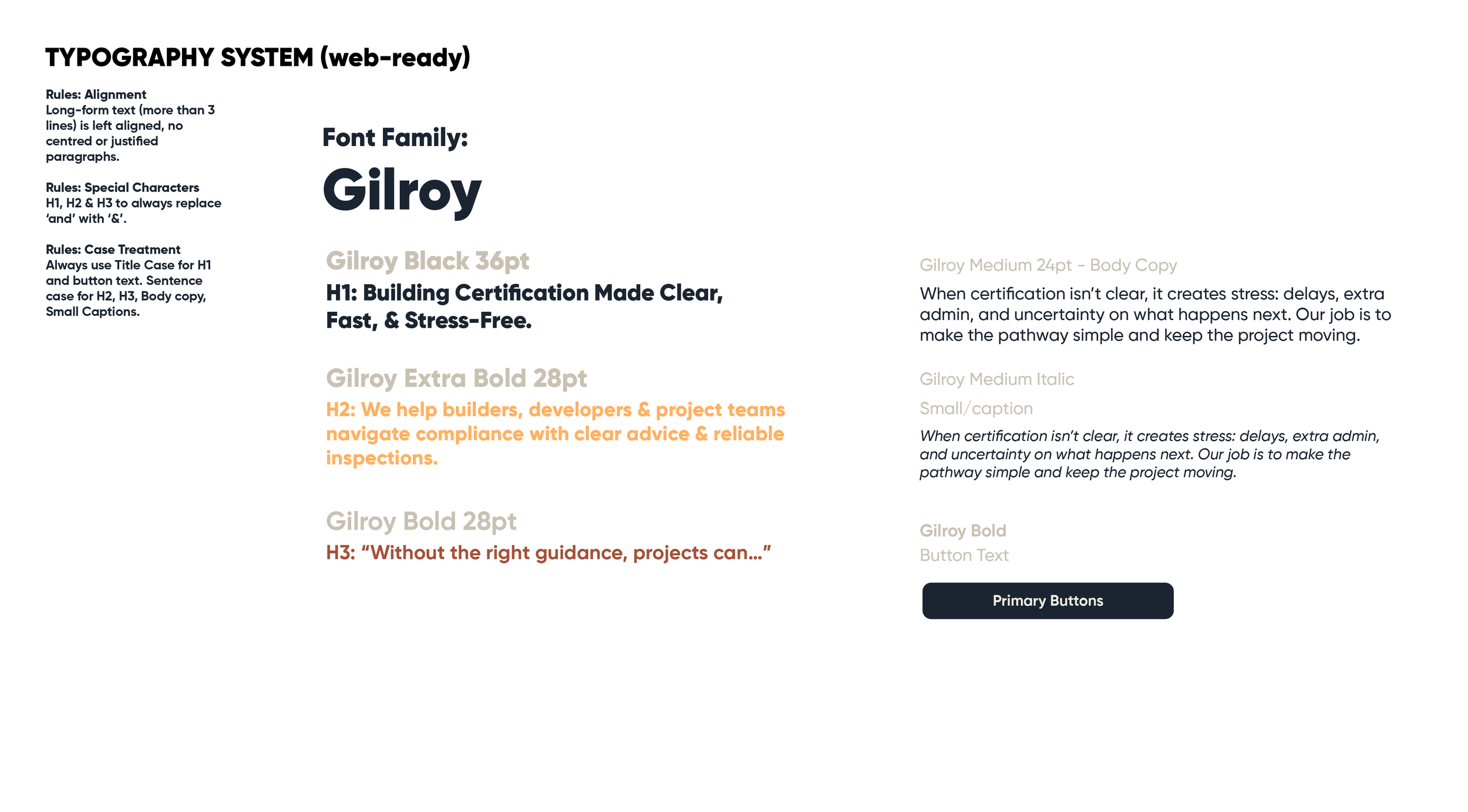
Cert Lane’s branding contained major inconsistencies in type styles and hierarchy, iconography inconsistencies and colour issues with the contrast ratio (which was 2.0:1 → fails WCAG AA)

TWO: Discovery & Audit


Key Findings
Users didn't understand the certification process
Service terminology created confusion
Navigation lacked clear customer pathways
Existing content focused on services rather than customer needs

THREE: Information Architecture
I restructured the site around customer intent, defining the purpose of each page, primary calls-to-action and content hierarchy before design commenced.
FOUR: User Flows
Created simplified pathways designed to reduce friction and guide users towards enquiry actions with confidence.


FIVE: UX WIREFRAMES
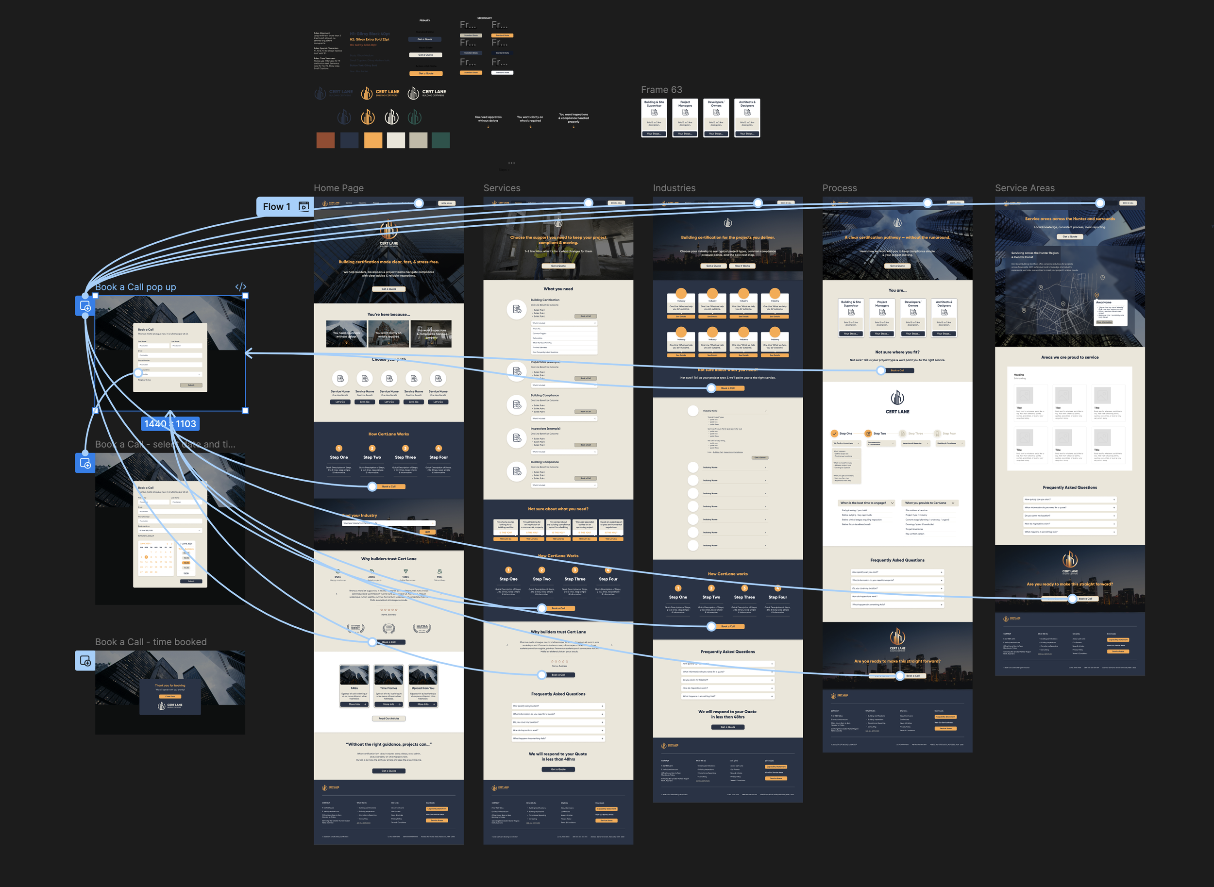
New Process Page introduced
Introduced a dedicated Process page to explain the certification pathway and reduce customer uncertainty.
"Not Sure What You Need?"
Created a routing mechanism for users unfamiliar with certification terminology.
Industry Pathways
Developed industry-specific content pathways to improve relevance and self-selection.
Confusion reduction section
Objection handling section
BRANDING
This is actually my area of expertise. Lets get into it...
CATEGORY 01: DEFINE WHO CERT LANE IS.
For this category, the brand has to communicate:
Trust / legitimacy (regulated service)
Clarity (less confusion, fewer surprises)
Calm competence (stress reduction)
Speed + reliability (but not “dodgy fast”)
So the design system should feel:
structured, readable, modern, restrained (not flashy)
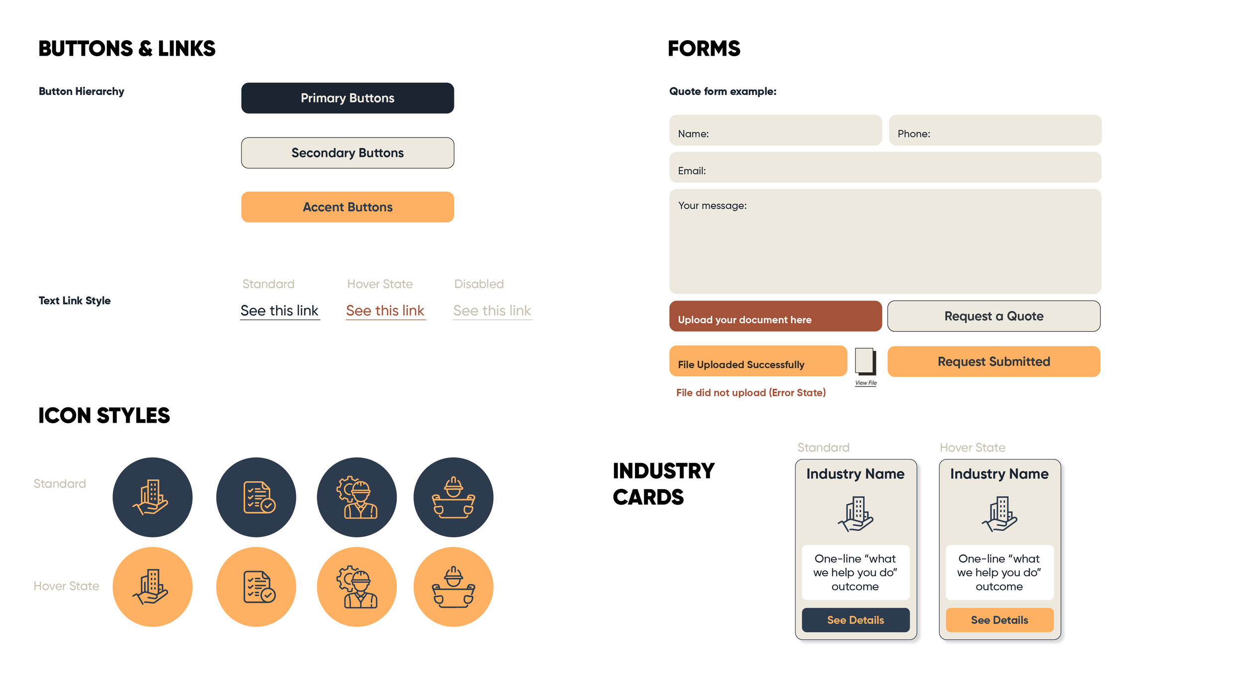
CATEGORY 02: BRANDING DELIVERABLES
Keeping aligned to the website project, my aim for Cert Lans is a Brand + UI Uplift, not a full rebrand.
UI mini kit
Type scale (H1/H2/H3/body)
Buttons (primary/secondary)
Form fields
Cards
Icons (style rules)
Spacing system (8pt grid)
Basic accessibility checks (contrast)

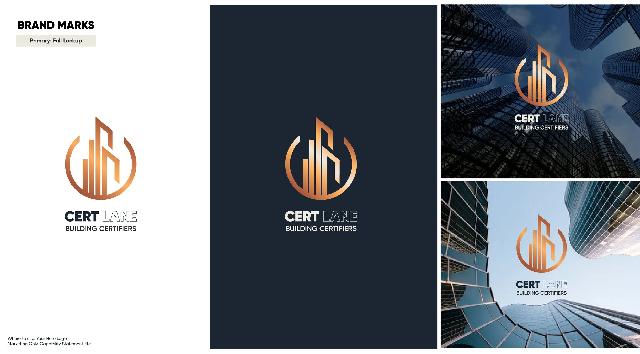
BRAND REFRESH
Not just logos.
The refreshed identity was developed to communicate professionalism, clarity and trust while improving accessibility and consistency across digital touchpoints.