Rebrand, Visual Identity System & Social Media Templates | Powered by Pilates
Powered by Pilates approached the rebrand with an existing visual identity that no longer reflected the quality, maturity or direction of the business.
The original branding had become outdated and needed to evolve into something more modern, clean and minimalist. In a competitive wellness and Pilates market, the brand needed an identity that felt refined and professional while still being approachable, calm and easy to recognise.
Mission: Create a visual identity that is:
modern without feeling cold
minimalist without feeling generic
timeless without feeling plain
polished without losing warmth
flexible enough to support future marketing and social media content
The existing brand no longer gave the business the visual confidence it needed. The client wanted a cleaner and more elevated identity that could help the studio stand out while still feeling aligned with the calm, considered nature of Pilates.
The Solution
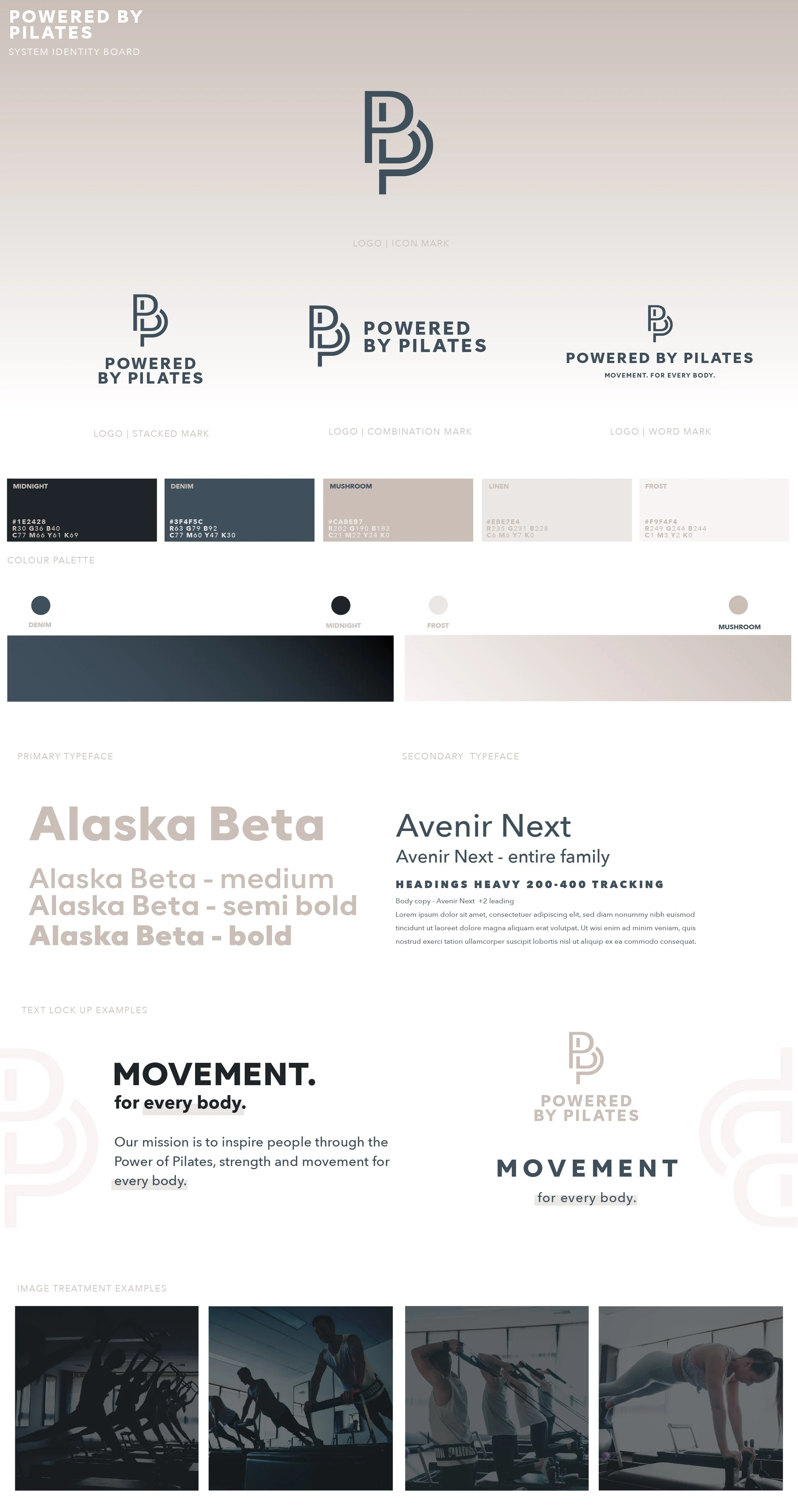
I developed a complete visual identity system for Powered by Pilates, expanding the original scope into a comprehensive brand guide.
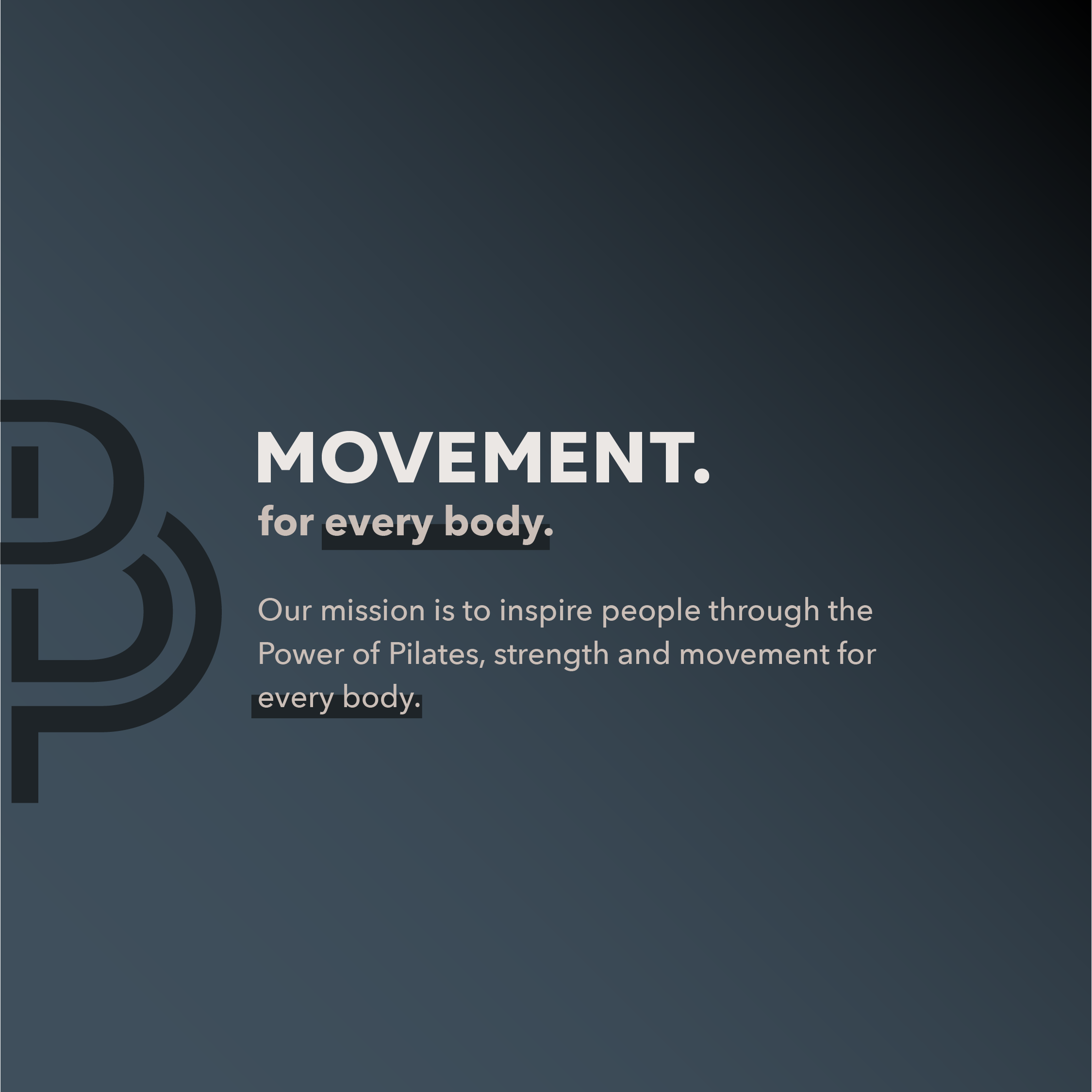
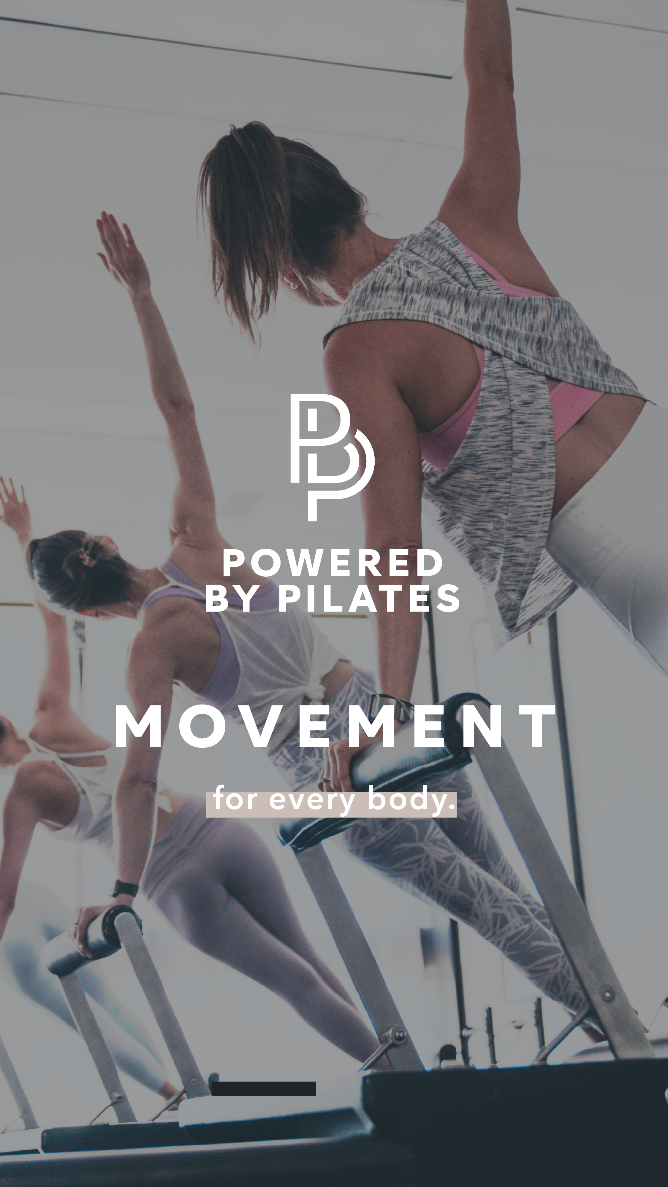
The final system included four logo types, a refined colour palette, gradient guidance, typography pairings, text lock-up rules, asset guidance, image treatment and a social media template suite.
This gave the client a clear framework for how the brand should appear across digital marketing, with enough flexibility to support different content types while maintaining a consistent look and feel.
Deliverables included:
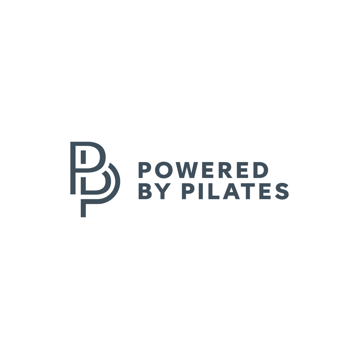
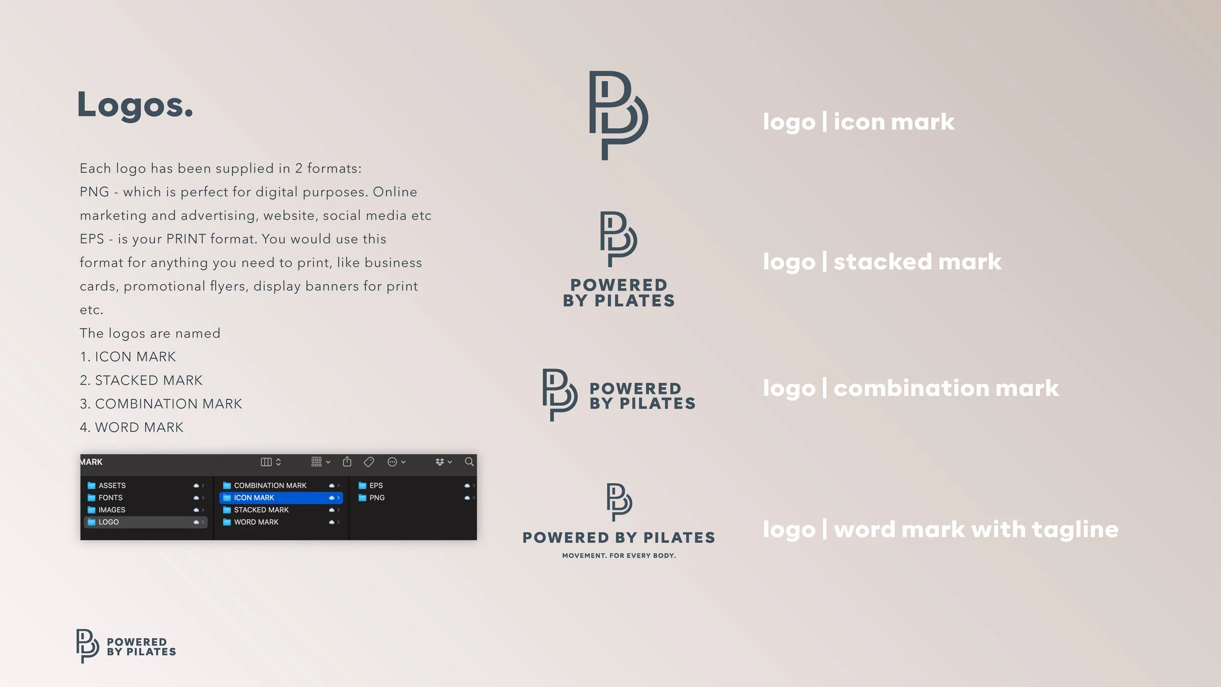
Four logo types
Visual branding board
Colour palette
Gradient guide
Typography pairings
Text lock-up guide
Asset guide
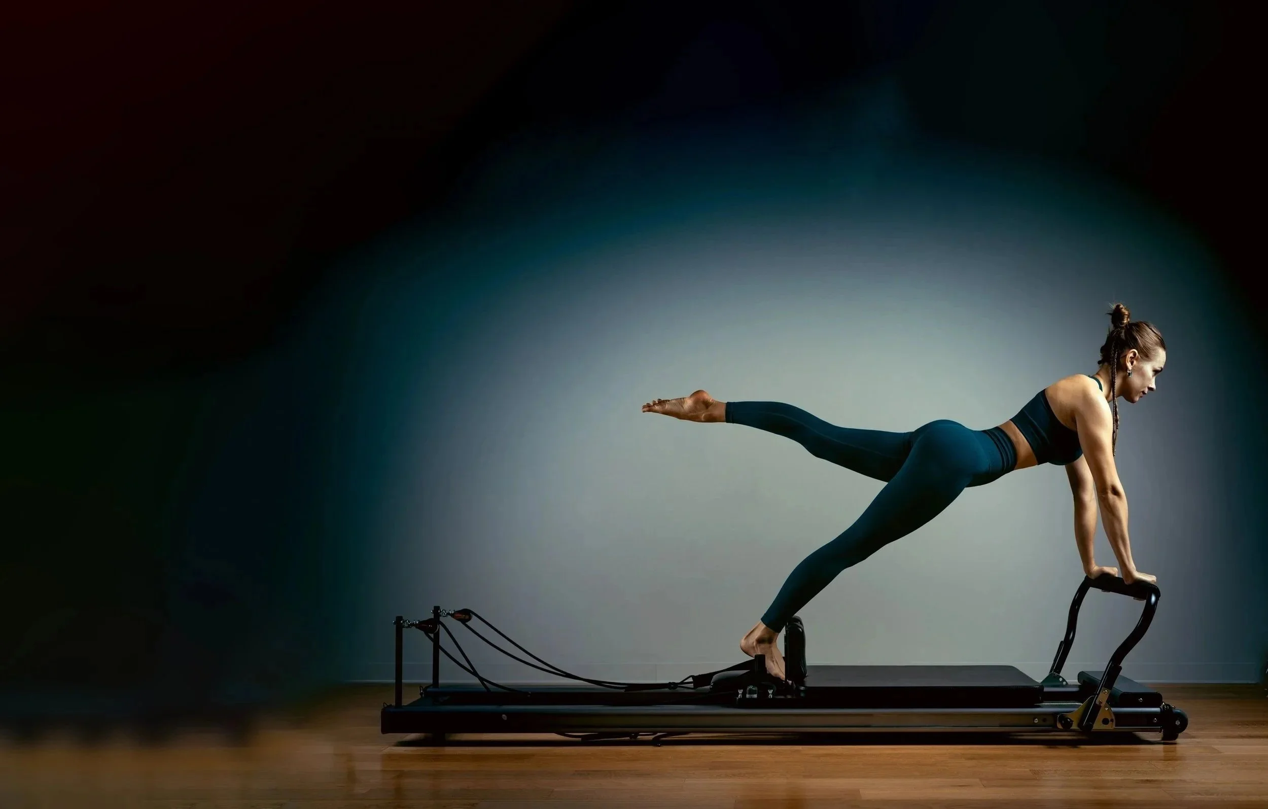
Image treatment direction
Social media template system
Comprehensive brand guide
The social media templates were designed as the chosen marketing stream, giving the client ready-to-use layouts that aligned with the new identity and created a more polished digital presence.
Outcome
The Powered by Pilates rebrand gave the business a more sophisticated and consistent identity system.
What began as a focused visual branding board and social media template project became a more comprehensive brand guide, providing the client with the structure and confidence to apply the brand across future marketing.
The final identity helped reposition Powered by Pilates with a cleaner, more premium and more timeless visual presence — giving the brand the tools to stand out in a competitive wellness market without relying on loud or overly trend-driven design.